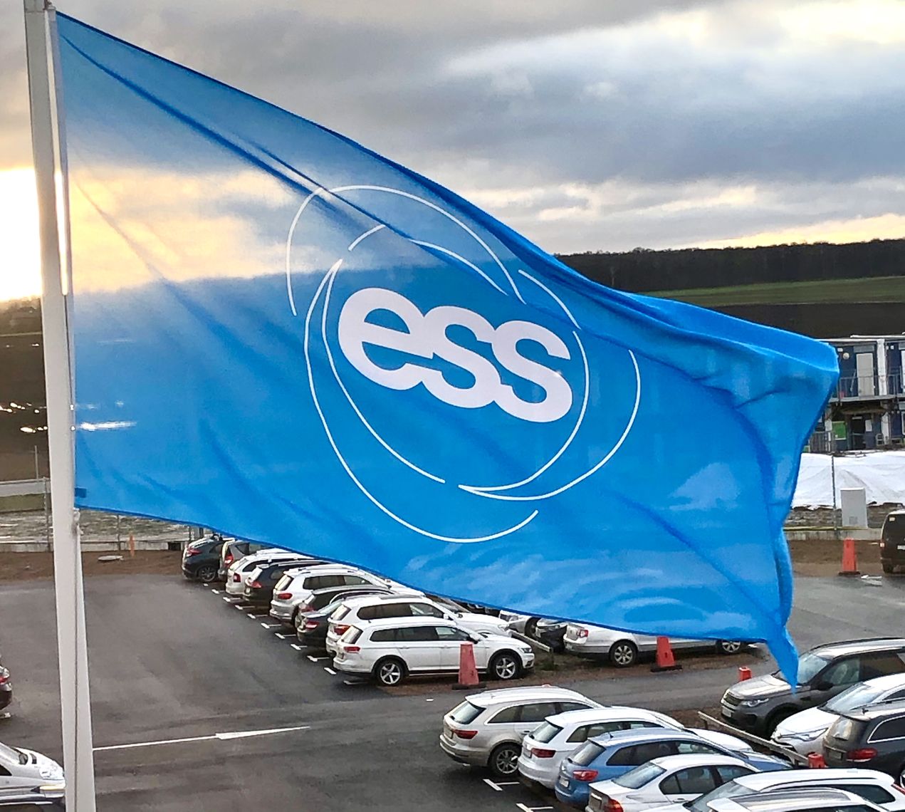
To kick off the New Year, ESS has undergone a small facelift - rolling out a new and improved visual identity! Apart from some tweaks to our logo and colour palettes, we are updating our official fonts, and now also have a new website address and new email addresses which reflect the nature of the enormous, collaborative European project that is ESS.
The ESS website address will now be www.ess.eu, while the domain of our email addresses will change to Firstname.Lastname@ess.eu. The old addresses will still work for a while, of course.
Being a world-leading research facility brings great responsibility, but also, big opportunities. We acknowledge that, in order to better reflect who we are and who we strive to be, we need to look the part of a credible and attractive Big Science organisation, synonymous with phrases like 'enabling scientific breakthroughs', 'changing the world' and 'the sky is the limit’ – as these phrases encompass the mindset for the sustainable future we are committed to achieving.
Our primary colour is still blue – or cyan, to be specific, inspired by the Cherenkov light, which presents as blue in water, and is emitted when a charged particle (e.g. an electron) travels through a medium, such as water, faster than light can. This phenomena, the Cherenkov effect, is named after Soviet physicist, Pavel Cherenkov, who shared the 1958 Nobel Prize in Physics for its discovery.
Our secondary colour palette includes complementary colours, like Navy, which is inspired by the sea which connects ESS host states, Denmark and Sweden; Grass ,which mirrors the lighter shades of Beech trees typical to this part of Scandinavia, symbolising hope and new beginnings, and Forest, which is often found gracing the barn doors through the region local to ESS.
The updated ESS visual identity aims to symbolise connection, harmony, balance and hope.